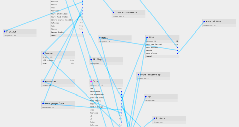

Nomismata provides users with four different ways to explore and analyze data, each suited to different research needs:
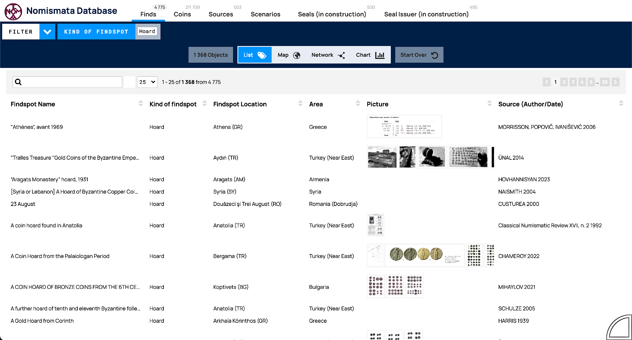
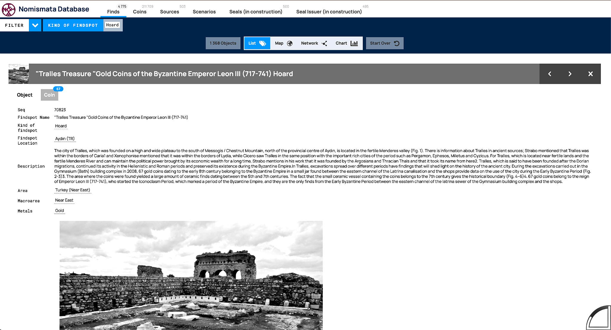
The List view presents a structured, column-based table of results. This format allows for:
This view is ideal for data management, textual analysis, and cataloging.
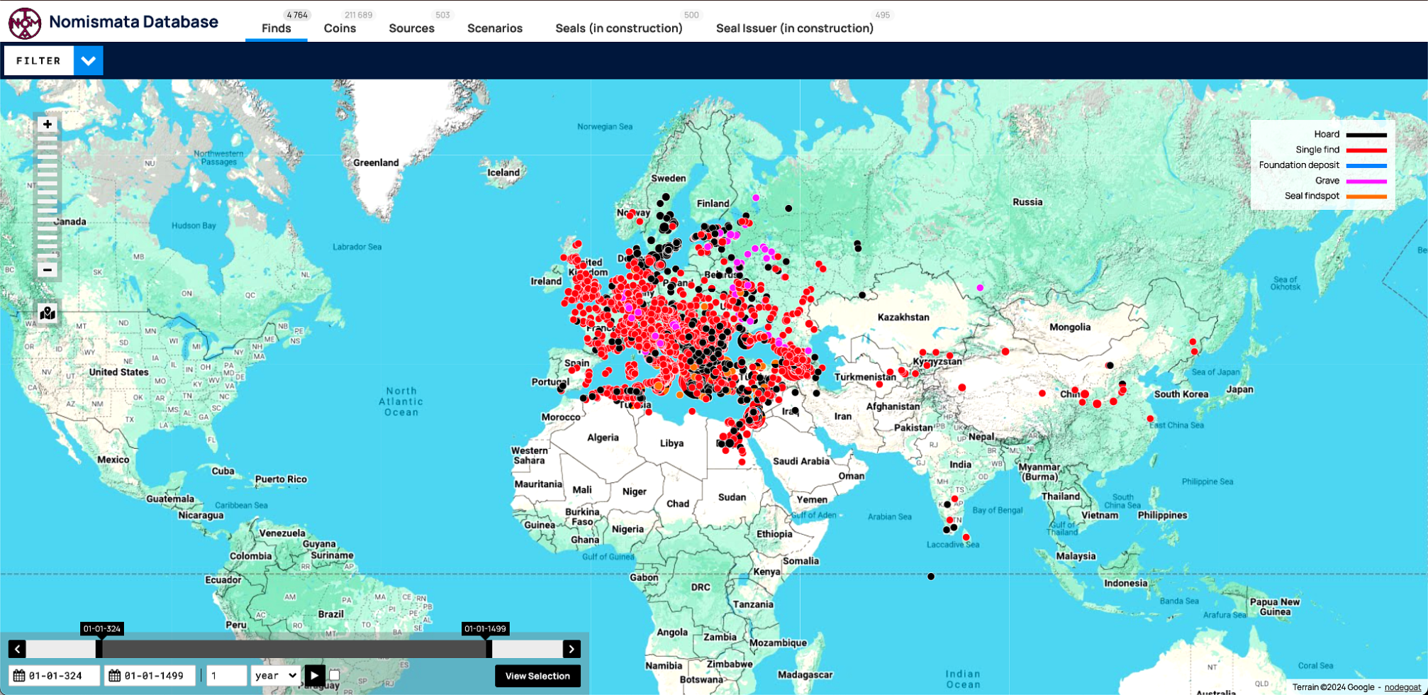
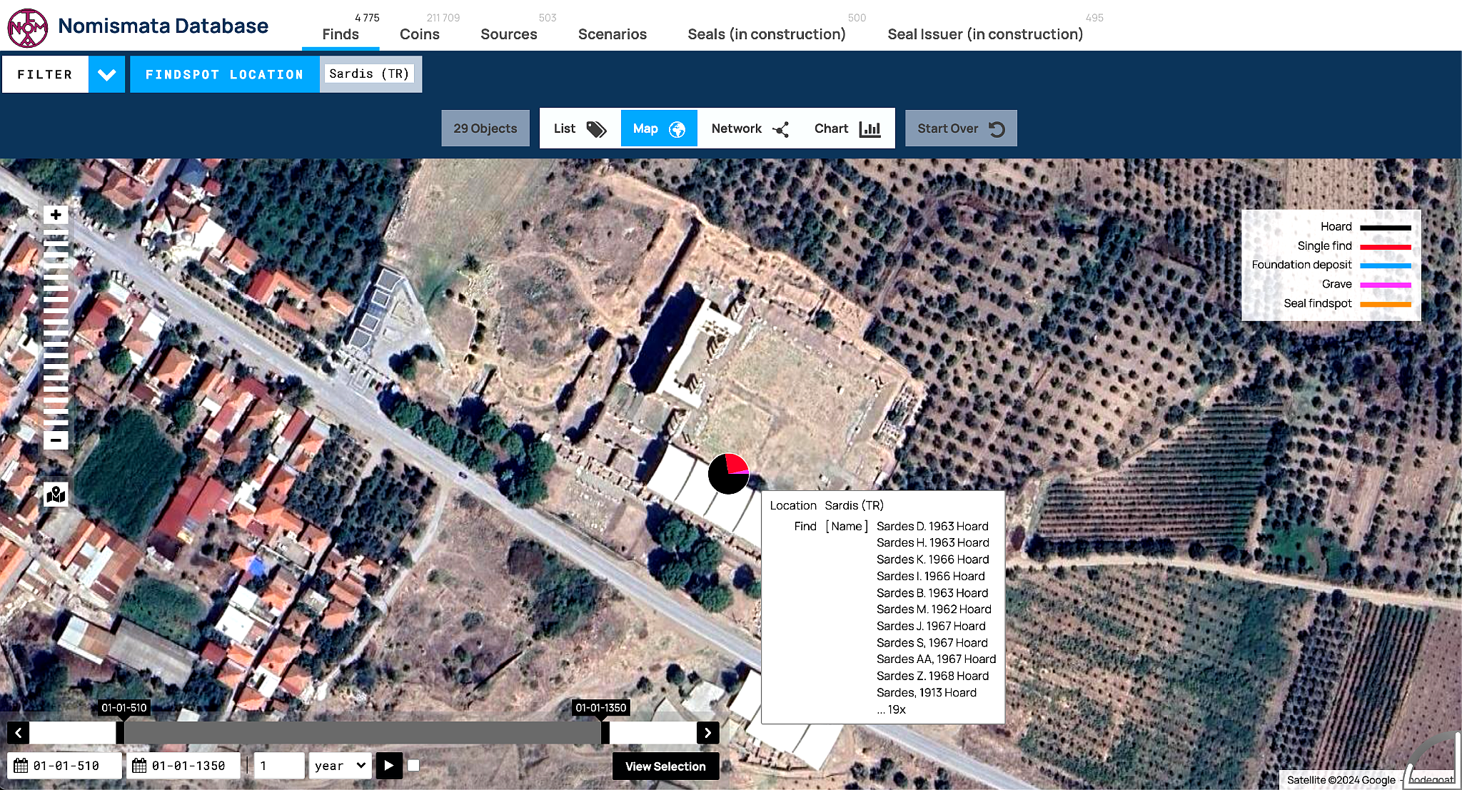
The Map view enables users to visualize finds and mints geographically.
This visualization is particularly useful for understanding the geographic distribution of numismatic data.
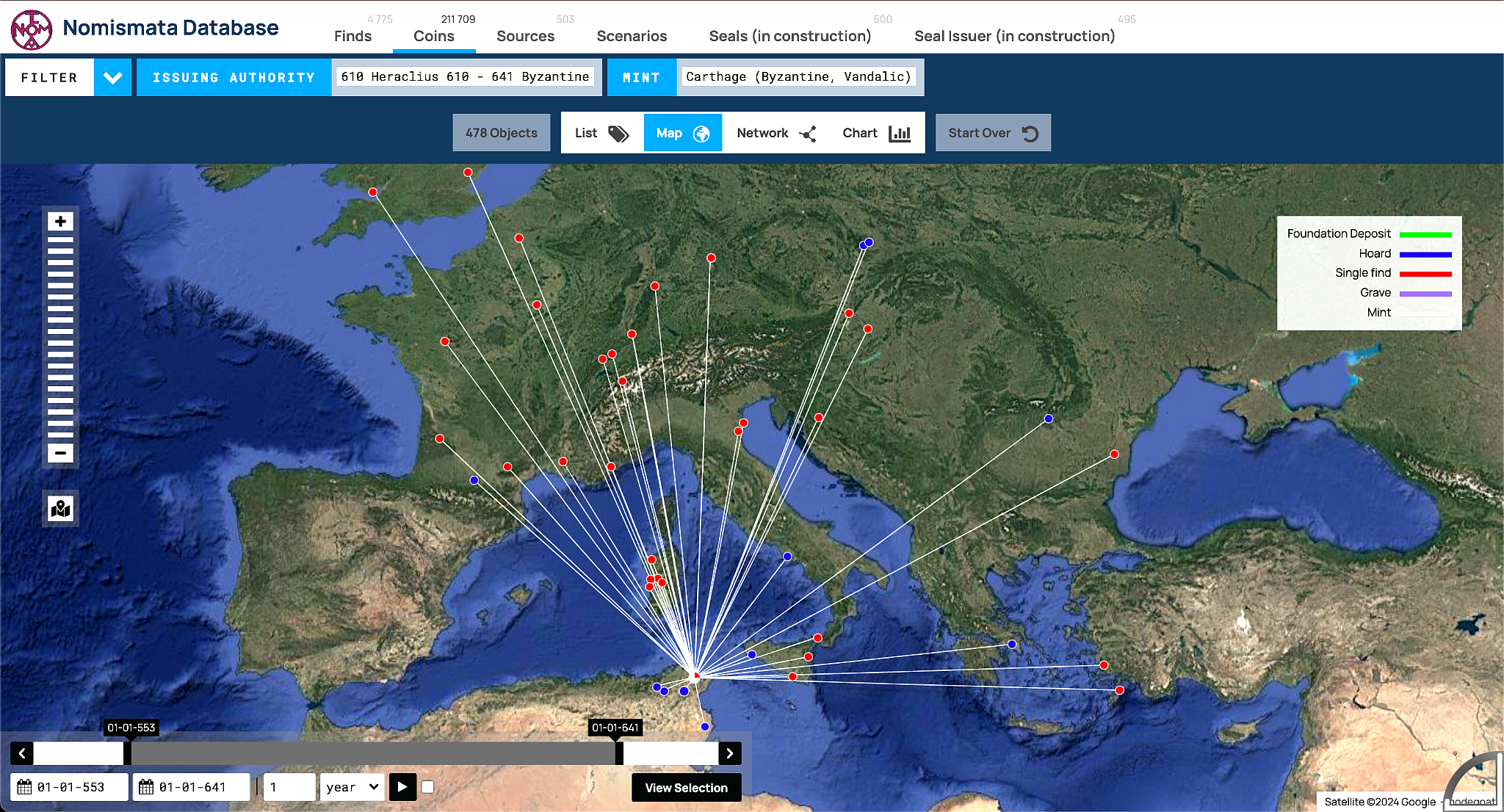
The Network view highlights connections between entities within the database.
This is an essential tool for studying complex historical networks and their evolution over time.
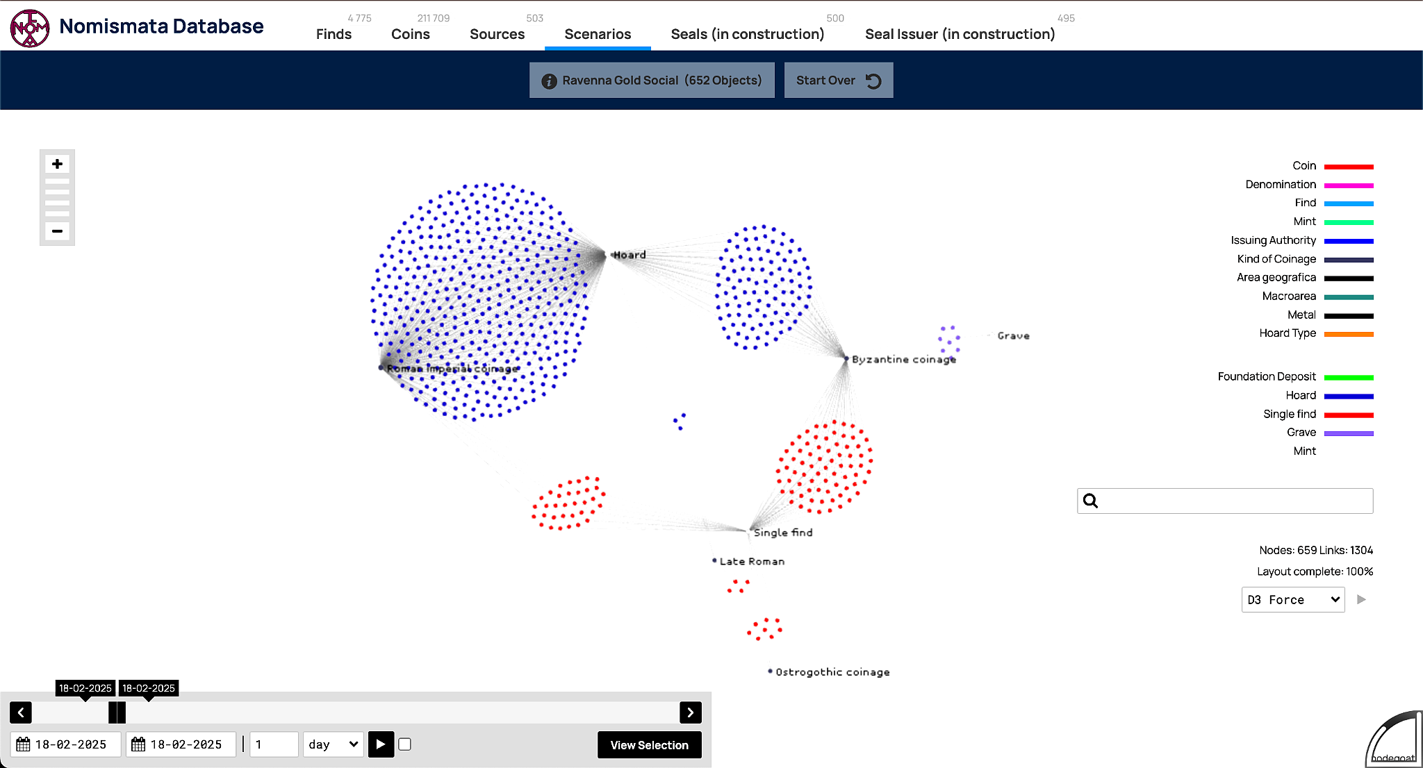
Here we see, for the mint of Ravenna, the relationship between finds (hoard, single, grave…) and coinage (Byzantine, Ostrogothic, Late Roman, Imperial Roman).
The Chart view allows for statistical and chronological analysis of numismatic data.
This feature is particularly useful for quantitative analysis and historical interpretation.
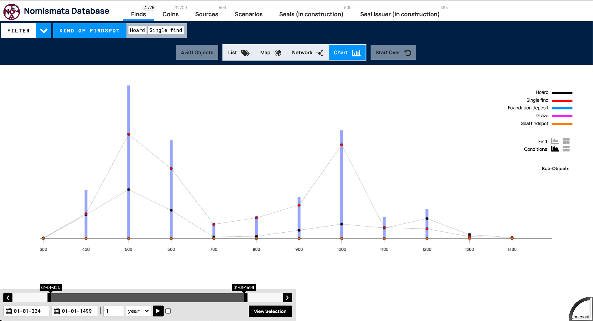
Here we see the temporal distribution of coin finds in Nomismata based on their terminus post quem. The distribution is not symmetrical, and this asymmetry reflects both the Dark Age and the fact that the territorial extent of the Byzantine Empire was highly variable over its 11 centuries of history.
Depending on your research goals, Nomismata allows you to switch seamlessly between these views:
✔ List → Best for detailed records and textual queries
✔ Map → Best for spatial analysis and geolocation
✔ Network → Best for understanding connections between data
✔ Chart → Best for detecting chronological trends
Together, these visualization tools enhance the analytical potential of Nomismata, making it a versatile platform for numismatic research.
